How To: True Masonry Layout
I’ve previously written about achieving the masonry layout effect and how to implement a pure CSS solution leveraging various techniques (that can be seen here).
Check out this pen by Jhey (@jh3y) on CodePen.
The biggest drawback with a pure CSS solution is ordering. Most people implementing a masonry layout in their projects want the classic left to right chronological ordering. It’s a common question about the pure CSS solution, “How can I order the items from left to right, 1, 2, 3?”. Unfortunately, this just doesn’t seem possible with a pure CSS solution. Not in a generic and dynamic sense at least 👎
So how can we create this “true” masonry layout with the correct ordering? We can still leverage CSS features but we’re going need a hint of JavaScript to get it just right 😎
For those in camp TL;DR who want to see this “true” masonry layout in action, here’s a demo 🤓
If you scroll to the bottom, you can see a demo with React and also a demo with loading images 😉
Check out this pen by Jhey (@jh3y) on CodePen.
Using Flexbox in a solution permalink
Previously, when exploring a pure CSS solution, I settled on using multi-column layout properties and using flexbox for clustering.
My thoughts about using flexbox alone lead me to believe I’d find issues regarding the height and wrap of the layout when using flex-direction: column
On first attempt I thought about mimicking the column layout by using “flex-direction: column”.The issue with using “column” is that you need to define a height for the layout so that columns start wrapping ..… or you need to keep adjusting the height of the layout until everything wraps and fits nicely how you want it to. If you are working with dynamic content that may vary in amount and size over time, you may find yourself adjusting to accommodate each time you roll it out.
If we introduce JavaScript, the issue of needing to adjust height becomes moot as we can react to changes in content and container size 🎉
So let’s begin looking at a solution. We’ll make the journey getting more complex as we go along (spoiler: it never gets that complex). We will start with the markup, then the CSS and lastly how we make it all work with that hint of JavaScript.
The markup permalink
Let’s begin by defining some markup. Nothing crazy here, a container with panels 👍
<div class="masonry">
<div class="masonry-panel">
<div class="masonry-panel__content"></div>
</div>
<div class="masonry-panel">
<div class="masonry-panel__content"></div>
</div>
</div>We have masonry class for our container, masonry-panel for our panels and masonry-panel__content for panel content.
For the demo, I decided to generate a random layout with panels of different sizes using pug
.masonry
- var n = 0
while n < 16
- var size = Math.floor(Math.random() * 450 + 1)
.masonry-panel
.masonry-panel__content(style=`height: ${size}px`)
h1= n
- n++We will look at adding images and dynamic content later on 😉
The CSS permalink
The CSS is quite simple but we will leverage a trick with the flexbox properties. Let’s start with the container.
.masonry {
display: flex;
flex-flow: column wrap;
max-width: 100%;
}The container is the top level element for our masonry layout. We are using flexbox so we need display: flex. max-width is set to ensure our layout doesn’t overflow. Last, we define the flex-flow. We want our content to wrap so we have set flex-wrap to wrap and we want the flex-direction to be column and not row. You might question the flex-direction. If we want our content to read from left to right then how is that possible using flex-direction: column? This is where we leverage the trick with flexbox properties.
We are going to use the order property to define the order in which are masonry-panels will render within the layout. If you’re not familiar with the order property
The CSS
orderproperty specifies the order used to lay out flex items in their flex container. Elements are laid out in the ascending order of theordervalue. Elements with the sameordervalue are laid out in the order in which they appear in the source code. — MDN
So what does that allow us to do? When we develop our markup, it’s likely to be in the order that we want it to display.
<div class="masonry">
<div class="masonry-panel">
<div class="masonry-panel__content">1</div>
</div>
<div class="masonry-panel">
<div class="masonry-panel__content">2</div>
</div>
<div class="masonry-panel">
<div class="masonry-panel__content">3</div>
</div>
<div class="masonry-panel">
<div class="masonry-panel__content">4</div>
</div>
</div>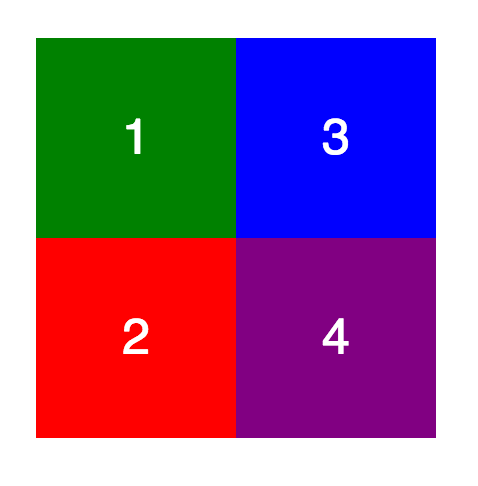
We haven’t touched on the height of the container yet, we will. A set height must be in place to make the columns wrap. If there is no set height then the columns will never wrap 😭. Let’s run through a quick example. Consider a layout where the panels are 100px high and wide. Our container is 200px high and wide and we have four panels.
When we don’t alter the order, the result will be that we get 1 and 2 in our first column and 3 and 4 in our second column. Well that’s no good 👎
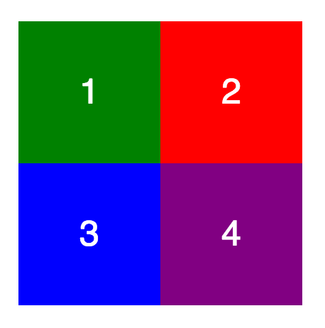
The desired effect we want is 1 and 3 in the first column and the 2 and 4 in the second column. How can you calculate the order for each panel though? You don’t need to calculate the exact order. If we remember that items with the same order are laid out in the order they appear in the DOM then all we need to worry about is which column we want each item to appear in 🙌
To illustrate this, consider the following. Instead of the the DOM order illustrated in the square, we render the order property value. Each panel in column one has the value 1. And each in column two has the value 2.
We can either set the order within our CSS or leave it and set it within our JavaScript. The latter will be easier if you’re not using a CSS preprocessor. For those using a CSS preprocessor, it is possible. But might be a little more complicated than doing so within JavaScript. We need to set the order for each panel based on the desired number of columns for each desired breakpoint. You can see this in the demo pen using stylus.
The only other properties we need to set for our masonry-panel are width and overflow. We set the overflow to hidden to make sure that panel content doesn’t spill out. The width is based on how many columns we want in our layout. Let’s consider a four column layout, that requires a 25% width for panels.
.masonry-panel {
overflow: hidden;
width: 25%;
}In order to go responsive(more on this at the end), we would set different widths and orders at different breakpoints. Commonly, on mobile devices we will only want one column. You might be developing mobile first, so you may have something like
.masonry-panel {
order: 1;
overflow: hidden;
width: 100%;
}
@media(min-width: 992px) {
.masonry-panel {
width: 25%;
}
.masonry-panel:nth-of-type(1),
.masonry-panel:nth-of-type(5) {
order: 1;
}
.masonry-panel:nth-of-type(2),
.masonry-panel:nth-of-type(6) {
order: 2;
}
}Setting responsive order and width is likely easier if leveraging a CSS preprocessor. If you’re not using a CSS preprocessor, you could set the responsive order from JavaScript. This would entail setting an inline order on window resize based on some given settings.
Any other CSS we put in place on the CSS side is for theming and aesthetics. For example, we may set padding on the panel content to give a gutter like effect.
.masonry-panel__content {
padding: 10px;
}Or we may wish to make our panels have animated entrances in order. This can be achieved with a CSS preprocessor as follows
.masonry-panel
animation scaleIn 0.25s both
for $panel in (1..$numberOfPanels)
&:nth-child({$panel})
animation-delay ($panel * 0.15s)
@keyframes scaleIn
from
transform scale(0)The JavaScript permalink
Last but not least is the JavaScript. We need the script in order to react to changes in viewport size and also to initially set up the layout by setting the correct height for our container.
So, let’s get started by creating a class for our layout.
const CLASSES = {
MASONRY: 'masonry',
PANEL : 'masonry-panel',
PAD : 'masonry-pad',
}
class Masonry {
constructor(el) {
this.container = el
this.panels = el.querySelectorAll(`.${CLASSES.PANEL}`)
this.state = {}
}
}Our class will take an element as its parameter. This element will be the containing element. It will keep a reference of the container and panels using internal references. We instantiate a state object for keeping a reference to the layout and content height.
Our first step is to start the layout but first a quick note on setting the order.
I prefer to set the order of panels via CSS in this example. This is so that I don’t need to keep reference and make checks within the JavaScript to media queries etc.
If we are going to set the order of our panels via JavaScript. This is a basis for how we could do it.
setOrders = () => {
const {
panels
} = this
// There needs to be an internal reference here that
// checks how many cols for viewport size
const cols = 3
panels.forEach((panel, idx) => {
panel.style.order = ((idx + 1) % cols === 0) ? cols : (idx + 1) % cols
})
}We would need some way of storing the Masonry settings though in some form of options Object. I’ve tackled a JavaScript which I detail later in this article. The React version I put together below also uses a JavaScript solution 👍
NOTE:: If using IE, you’ll need to use something like a for loop to iterate over that NodeList for panels else it won’t work.
Once order is out of the way let’s get under way with setting up the layout.
We create a layout method in the class that will be responsible for running individual tasks that sort the layout.
layout = () => {
this.reset()
this.populateHeights()
this.setLayout()
this.pad()
}This method will be invoked from within the constructor and also on viewport size changes to reset and initialize the layout.
Let’s go through these individual methods one by one.
reset permalink
A reset method for each time we want to re-layout. We use this method to reset internal state, reset styles and remove padding elements. More on padding elements when we get to the pad method*.*
reset = () => {
const { container } = this
this.state.heights = []
const fillers = container.querySelectorAll(`.${CLASSES.PAD}`)
if (fillers.length) {
for (let f = 0; f < fillers.length; f++) {
fillers[f].parentNode.removeChild(fillers[f])
}
}
container.removeAttribute('style')
}UPDATE:: It was brought to my attention that the first iteration of this code wouldn’t play nice in IE. That was due to using forEach on a NodeList and also making use of remove on elements. The workaround has been to revert to using a for loop and use parentNode.removeChild. Sorry for any issues this caused 😇
populateHeights permalink
This method is where we determine the height of our content.
populateHeights = () => {
const { panels, state } = this
const { heights } = state
for (let p = 0; p < panels.length; p++) {
const panel = panels[p]
const { order: cssOrder, msFlexOrder, height } = getComputedStyle(panel)
const order = cssOrder || msFlexOrder
if (!heights[order - 1]) heights[order - 1] = 0
heights[order - 1] += parseFloat(height, 10)
}
}We iterate through the panel elements and get the computed style for each. For each height we need to add this to a height reference array. We know which reference in the height array to add the height to based on the order property of the panel.
For an example; we have a four column layout so heights will start out as
[ 0, 0, 0, 0 ]We get to the first panel, it has height of 75. This gives us
[ 75, 0, 0, 0 ]When we’ve added the height for our second, third and fourth panel, we get back to another panel with order of 1 so we need to add that height onto the first height. Consider it has a height of 25, then heights[0] becomes 100
[ 100, 45, 50, 30 ]Once we have the heights of each column we just need to set the layout correctly based on this.
setLayout permalink
This likely doesn’t need its own method but feels nicer to have that separation of concerns. In this method we simply set the height of the container based on the column heights.
setLayout = () => {
const { container, state } = this
const { heights } = state
this.state.maxHeight = Math.max(...heights)
container.style.height = `${this.state.maxHeight}px`
}This will get you pretty much there. The layout will work now 🎉 but not in every scenario 👎
pad permalink
This is where the concept of padding comes in. Currently, we have our content within the fixed height container. The height has been set based on the content height. But, it’s likely that the columns aren’t all the same height. The tallest column content won’t spill out. But, there are scenarios where the other columns could have content that spills. This isn’t the desired effect.
So how can we combat this? The solution for me has been to introduce padding elements. These fill out the remaining space in a column that is not as tall as the tallest column. The following image illustrates padding filling out the shorter columns (padding is orange)

So what does the code for pad look like?
pad = () => {
const { container } = this
const { heights, maxHeight } = this.state
heights.map((height, idx) => {
if (height < maxHeight && height > 0) {
const pad = document.createElement('div')
pad.className = CLASSES.PAD
pad.style.height = `${maxHeight - height}px`
pad.style.order = idx + 1
pad.style.msFlexOrder = idx + 1
container.appendChild(pad)
}
})
}Here we iterate over the heights reference which maps to layout columns. We determine whether we need to generate a padding element for a column. If necessary we create a set height element that fills the required space.
This padding ensures our elements are always in the column we expect them to be 😀👍
All that’s left to do is generate our markup and then initialize the layout. Later, we will integrate that resize listener into the class.
window.myMasonry = new Masonry(document.querySelector(`.${CLASSES.MASONRY}`))
// NOTE:: For better performance, debounce this!
window.addEventListener('resize', myMasonry.layout)Going responsive permalink
Going responsive isn’t that tricky once you’ve defined your responsive boundaries. The only decision left is how you wish to put in place the responsive element of your masonry layout.
First, we need to define the responsive boundaries. The viewport size limits and how many columns you want to see at each one.
For me, I’ve named the boundariessm, md, lg and xl. The value for each will be it’s upper bound. For example, sm will be any viewport up until 430px in width.
sm = 430px
md = 768px
lg = 992px
xl = 1500pxNext, define how many columns you wish to see for each boundary.
sm = 1
md = 2
lg = 3
xl = 4Now we need to implement it!
Let’s start with the simplest responsive property, the width of a panel at each boundary.
panel width = 100% / number of columns for boundary
This will be best implemented within our CSS.
@media (min-width: 430px) {
.masonry-panel { width: 100%; }
}
@media (min-width: 768px) {
.masonry-panel { width: 50%; }
}
@media (min-width: 992px) {
.masonry-panel { width: calc(100% / 3); }
}
@media (min-width: 1500px) {
.masonry-panel { width: 25%; }
}If we make use of a CSS preprocessor such as stylus we can define a configuration. Using the configuration, we can iterate over it to generate our styles. We define the max number of items in our layout with the items key. This is so that we don’t create unnecessary style declarations for items that won’t render.
$config = {
items: 16,
responses: {
breakpoints: {
sm: 430px
md: 768px
lg: 992px
xl: 1500px
},
cols: {
sm: 1,
md: 2,
lg: 3,
xl: 4,
}
}
}The iteration to create the width for our panels at different breakpoints is then as simple as
.masonry-panel
for $breakpoint, $value in $config.responses.breakpoints
define('$cols', $config.responses.cols[$breakpoint])
@media(min-width $value)
width (100% / $cols * 1%)The trickier of the responsive properties to implement is order. I’ve chosen to implement this using stylus. It could be done on the JavaScript side though. I’ll explain how in a moment.
First, this is how I’ve implemented responsive order for the panel elements using the config object with stylus.
.masonry-panel
for $breakpoint, $value in $config.responses.breakpoints
define('$cols', $config.responses.cols[$breakpoint])
@media(min-width $value)
width (100% / $cols * 1%)
for $panel in (1..$config.items)
&:nth-child({$panel})
$newOrder = $panel % $cols
if $newOrder == 0
$newOrder = $cols
order $newOrderWe hook into the iteration we used for generating the width property and tack on nth-child rules. For each child, we set the appropriate order for that child at that breakpoint. We calculate the order using modulo. As order can’t be 0, if $panel % $cols is 0 then the order must be the amount of columns at that breakpoint 👍
How about a JavaScript solution? We could set the order of elements in a method that checks the current viewport size. We’d also need to declare the responsive config within our JavaScript
We can start by creating a configuration Object that is passed into our constructor.
const masonryConfig = {
breakpoints: {
sm: 430,
md: 768,
lg: 992,
xl: 1500,
},
cols: {
sm: 1,
md: 2,
lg: 3,
xl: 4,
}
}Then our methods for ascertaining breakpoint and desired columns along with setting panel styles could look like
getViewportCols = () => {
const { config } = this
let breakpoint = 0
for (let b of Object.keys(config.breakpoints)) {
if (window.innerWidth > config.breakpoints[b]) breakpoint = b
}
return config.cols[breakpoint]
}
setPanelStyles() {
const { getViewportCols, panels } = this
const cols = getViewportCols()
for (let p = 0; p < panels.length; p++) {
panels[p].style.order = (p + 1) % cols === 0 ? cols : (p + 1) % cols
panels[p].style.width = `${100 / cols}%`
}
}We’d just need to add the setPanelStyles method as one of the lifecycle methods of layout. This would get invoked on iniialization and every consequent re-layout that happens as a result of viewport size change 🎉
Dynamic Content permalink
There can sometimes be issues when we want to start loading images into our masonry layout. The issue being that we run our layout code but then all our images load and break the layout.
Fear not, there is a way to combat this.
There is a fantastic package called imagesLoaded that we can leverage. Using imagesLoaded we can hook into when our images load and re-run the layout method.
const myMasonry = new Masonry(el, masonryConfig)
const load = imagesLoaded(myMasonry.container, () => myMasonry.layout())
load.on('progress', (instance, image) => {
// This trick allows us to avoid any floating pixel sizes
image.img.style.height = image.img.height
image.img.setAttribute('height', image.img.height)
image.img.classList.remove('loading')
// NOTE:: Not the cleanest thing to do here
const parentPanel = image.img.parentNode.parentNode
parentPanel.setAttribute('style', `height: ${image.img.height}px`)
parentPanel.classList.remove(`${CLASSES.PANEL}--loading`)
myMasonry.layout()
})What we are doing here is saying, when all images have loaded run the layout code. But to go one step further, we run it after every image has loaded.
You may question why are we setting the height of the image? This is actually to avoid float heights like 400.678px. These can cause bugs in the layout.
You can check out a demo for a responsive masonry image gallery at the bottom of this article 👍
And that’s it! How to create the “true” masonry layout effect with ordering from left to right by leveraging flexbox properties and adding a hint of JavaScript to help out 🎉
I’ve included some demos also for reference. These include loading dynamic content and a react version using styled-components.
Check out this pen by Jhey (@jh3y) on CodePen.