How To: Pure CSS Masonry Layouts
One popular content layout style is “masonry”. Not familiar with it? Think Pinterest, Windows’ Metro etc. To describe it in words, an almost crazy paving effect whereby variable sized blocks of content are pieced together in an aesthetically pleasing style, often staggered.
Masonry style layouts aren’t something new. So why look at them now? There are some great solutions out there for getting the masonry effect already aren’t there? This is true. However, can we push a pure CSS solution a little further? Could we leverage Flexbox to achieve a more desired effect and push the capabilities a little further?
For those in camp TL;DR feel free to check out some code I’ve pieced together here(github), the code for this post here or the more polished version here. Alternatively, here’s a demo of the end result 😇
Check out this pen by Jhey (@jh3y) on CodePen.
NOTE: If you need your content to go from left to right in a date ordered style, pure CSS masonry might not be the right solution for you. I have put together a post though on creating that style of masonry layout with some JavaScript help here 😊
The basic effect permalink
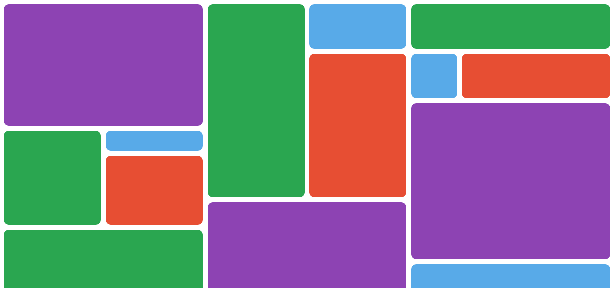
Let’s start with a basic layout. Imagine the DOM structure for our layout to be something similar to the following;
<div class="masonry-layout">
<div class="masonry-layout__panel">
<div class="masonry-layout__panel-content">
<-- CONTENT HERE -->
</div>
</div>
<div class="masonry-layout__panel">
<div class="masonry-layout__panel-content">
<-- CONTENT HERE -->
</div>
</div>
<div class="masonry-layout__panel">
<div class="masonry-layout__panel-content">
<-- CONTENT HERE -->
</div>
</div>
<-- FOLLOWING CONTENT PANELS -->
</div>We are looking to add columns to our content. Based on our DOM structure, can we can achieve a pretty basic masonry effect withminimal effort using either CSS3 multi-column layouts or Flexbox?
What are multi-column layout properties and Flexbox? permalink
Both introduced with CSS3, multi-column layout properties and Flexbox address ways in which to lay out content. Both have pretty apt names. Multi-column layout properties give you the power to lay out content in columns without too much heavy lifting. Flexbox provides exactly that, flexible boxes for your layout that can shrink, grow and flow how you desire. I won’t be going through them in detail in this post so I’d recommend familiarising yourself with them before reading any further.
Using multi-column layout properties permalink
CSS3 introduced multi-column layouts with properties such as column-count and column-gap. This makes achieving a basic masonry effect rather simple. Note that it is important to use the break-inside property on the content blocks of the layout. This ensures that content blocks don’t break and span across columns. The CSS for a starting point could be;
.masonry-layout {
column-count: 3;
column-gap: 0;
}
.masonry-layout__panel {
break-inside: avoid;
padding: 5px;
}
.masonry-layout__panel-content {
padding: 10px;
border-radius: 10px;
}See it in action here. It’s a good start and shows that the multi-column layout properties can do a lot of the heavy lifting for us.
Using Flexbox permalink
Could we achieve the same with Flexbox? It isn’t quite as loose and forgiving as using the multi-column layout properties. I found issues with the approaches I took trying to tackle the issue with Flexbox.
On first attempt I thought about mimicking the column layout by using “flex-direction: column”. The issue with using “column” is that you need to define a height for the layout so that columns start wrapping. But this isn’t ideal as any overflow becomes horizontally scrollable. Either that or you need to keep adjusting the height of the layout until everything wraps and fits nicely how you want it to. If you are working with dynamic content that may vary in amount and size over time, you may find yourself adjusting to accommodate each time you roll it out. This pretty much goes against the ideals of Flexbox in my opinion.
Consider the following code using Flexbox;
.masonry-layout {
display: flex;
flex-direction: column;
flex-wrap: wrap;
padding: 10px;
height: 100vw;
}
.masonry-layout__panel {
display: flex;
flex: 1 1 auto;
width: 33.3%;
margin-bottom: 10px;
border-radius: 10px;
}It will yield a result which can be seen here. Notice that the content becomes horizontally scrollable which isn’t desired.
Anotherapproach is to use “flex-direction: row”. This doesn’t quite work either. You can set the amount of columns by restricting the width of items in the layout, but, wrapping either introduces white space or all items adjusting to be the same width depending on the property you define for “align-items”. Neither result is desirable. You can see the result of using “flex-direction: row” with “align-items: flex-start” here.
If you’re willing to be a bit more controlling with your markup and structure, you can achieve the desired effect with flexbox. Consider a structure like the following;
<div class="masonry-layout">
<div class="masonry-layout__column">
<div class="masonry-layout__panel></div>
<div class="masonry-layout__panel></div>
</div>
<div class="masonry-layout__column">
<div class="masonry-layout__panel></div>
<div class="masonry-layout__panel></div>
</div>
</div>Adding columns to your layout, you are given some extra control over the layout. However, you will need to give some more thought to how and where you want specific parts of your content to sit. See this approach in action here.
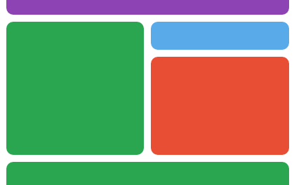
Going with multi-column layout properties permalink
For achieving the basic masonry style layout, multi-column layout properties are a clear winner in my opinion. This is based on the simplicity and reduced markup. They get the job done. If you’re looking for the basic masonry effect, then something like this is all you’ll need. I can see the benefit of both approaches though for sure.
.masonry-layout {
column-count: 3;
column-gap: 0;
}
.masonry-layout__panel {
break-inside: avoid;
padding: 5px;
}
.masonry-layout__panel-content {
padding: 10px;
border-radius: 10px;
}Looking at that code. Our panels should also be blocks themselves ideally. So we refactor to.
.masonry-layout {
column-count: 3;
column-gap: 0;
}
.masonry-layout-panel {
break-inside: avoid;
padding: 5px;
}
.masonry-layout-panel__content {
padding: 10px;
border-radius: 10px;
}Our basic masonry effect still has potential. We could take it a little further. Maybe Flexbox will fit nicely elsewhere.
Nested clusters of content permalink
Introducing nested clusters of content to our layout can break the content up a bit and disturb the flow a little which is our intention. It can be used to give the effect that content is spanning columns.
Nested clusters of contents are essentially nested layouts that will either flow vertically or horizontally. Flexbox is a great fit here.
A vertically flowing 2 column nested cluster
Our base layout doesn’t fit perfectly into a quadrangle but our clusters must. This is because we don’t want patches of white space appearing in our masonry layout. We could define cluster size classes to combat this. Consider the following example sizes;
.masonry-layout-panel--small {
height: 200px;
}
.masonry-layout-panel--medium {
height: 300px;
}
.masonry-layout-panel--large {
height: 400px;
}But, this doesn’t quite feel right. Set sizes aren’t going to play nice in every scenario. The better approach may be to introduce the column-like containers we discussed earlier. Consider something like the following;
<div class=”masonry-layout-panel masonry-layout-cluster masonry-layout-cluster--vertical”>
<div class=”masonry-layout-cluster__segment masonry-layout-cluster__segment--column”>
<div class=”masonry-layout-panel masonry-layout-cluster__segment”>
<div class=”masonry-layout-panel__content”>
<h1>hello</h1>
</div>
</div>
</div>
<div class=”masonry-layout-cluster__segment masonry-layout-cluster__segment--column”>
<div class=”masonry-layout-panel masonry-layout-cluster__segment”>
<div class=”masonry-layout-panel__content”>
<h1>yes</h1>
</div>
</div>
<div class=”masonry-layout-panel masonry-layout-cluster__segment”>
<div class=”masonry-layout-panel__content”>
<p>
Some cool pics.
</p>
</div>
</div>
</div>
</div>Clusters can either flow horizontally or vertically. If a cluster flows horizontally, we define columns of segments that flow vertically and vice-versa. We alter the flow using “flex-direction”. Cluster segments grow/shrink to accommodate white space with clusters becoming blocks in themselves.
If we want some tighter control on the cluster segments, we can use utility classes to define percentage flex-basis for them. We don’t need a “full-size” utility class as we can just include one item in a container and it will span full width or height. For say “half-size” though we could define 50% flex-basis. The nice feature of this implementation is that any number of rows or columns should span accordingly to the content.
How might the code look? Consider the following;
.masonry-layout-cluster {
display: flex;
padding: 0;
}
.masonry-layout-cluster--vertical {
flex-direction: row;
}
.masonry-layout-cluster--horizontal {
flex-direction: column;
}
.masonry-layout-cluster__segment {
display: flex;
flex: 1 1 auto;
}
.masonry-layout-cluster__segment--row {
flex-direction: row;
}
.masonry-layout-cluster__segment--column {
flex-direction: column;
}
.masonry-layout-cluster__segment--half {
flex-basis: 50%;
}
.masonry-layout-cluster__segment--quarter {
flex-basis: 25%;
}You can see the code in action here. Nested clusters are the trickiest concept to explain, and with them out of the way, we can tackle some easier features!
Theming & image panels permalink
The aim is to keep our layout structure styling generic and isolated from theming styles. This promotes easier re-use in other projects. If you’ve checked out any of the code demos mentioned previously, you’ll notice that content panels have rounded borders etc. This can be achieved by adding some minimal theming.
A picture panel
.masonry-layout-panel__content {
border-radius: 10px;
overflow: hidden;
padding: 10px;
}How about images? It’s quite common that you may wish to display images as complete panels in your masonry layout. If we put an image within our panel content it would be affected by the padding we’ve defined for our theme previously. So why don’t we just give the “masonry-layout__panel-content” class to our image with a modifier?
<img src="img/photo.jpg" class="masonry-layout-panel__content--img" alt="">It’s nearly there but not quite. If we add a little theming specific to images we can get round this.
.masonry-layout-panel__content--img {
max-width: 100%;
padding: 0;
}Check out how it’s starting to look here. Note: Because the classnames are becoming rather bloated, from here on, abbreviations are being used in code examples. For example; “masonry-layout” becomes “ml”, “masonry-layout-cluster” becomes “ml-clstr” etc. Also, image placeholders display in yellow.
Animating panels on hover permalink
How about making panels respond to interaction? We could make it so that panels flip and reveal extra content when we hover over them. In order to do this we make our panel content a flip card. Adding a front and back content container we can define the front and back for a panel. This does requires that we have a set height for our panels so we can use utility classes for defined heights. For example;
.masonry-layout-flip--medium {
height: 300px;
}We introduce a new block for flippers.
<div class=”masonry-layout-panel masonry-layout-flip--medium masonry-layout-flip”>
<div class=”masonry-layout-panel__content masonry-layout-flip__content”>
<img src=”img/photo-1.jpg” class=”masonry-layout-flip__panel masonry-layout-flip__panel--front masonry-layout-flip__panel--img”/>
<div class=”masonry-layout-flip__panel masonry-layout-flip__panel--back”>
<p>Here is a flpped image…</p>
</div>
</div>
</div>Using CSS3 transforms and transitions we can apply a hover animation so that our panel flips and shows a reverse side to it.
.masonry-layout-flip {
perspective: 1000;
}
.masonry-layout-flip:hover .masonry-layout-flip__content {
transform: rotateY(180deg);
}
.masonry-layout-flip--md {
height: 300px;
}
.masonry-layout-flip__panel {
backface-visibility: hidden;
border-radius: 10px;
height: 100%;
left: 0;
overflow: hidden;
position: absolute;
top: 0;
width: 100%;
}
.masonry-layout-flip__panel--front {
transform: rotateY(0deg);
z-index: 2;
}
.masonry-layout-flip__panel--back {
transform: rotateY(180deg);
}
.masonry-layout-flip__content {
height: 100%;
overflow: visible;
position: relative;
transform-style: preserve-3d;
transition: 0.25s;
}The layout is taking shape, see the animated panel in action here.
We aren’t just limited to flip panels. We could add various effects and features to panels such as focus effects. I’ll include some bonus features in the final bonus code.
Going responsive permalink
If you’ve got this far, you’ll notice that our masonry layout isn’t looking great on smaller viewports. Let’s make it responsive. How do we want it to respond? As our viewport increases in size, we want to increase the amount of columns in our layout. As our viewport decreases in size, in addition the amount of columns decreasing, we might want our nested clusters to collapse and allow the segments to take up full width of the layout. We will also be looking to develop our layout styles mobile first. Consider the following for responsive column count;
.masonry-layout {
column-count: 1;
column-gap: 0;
}
@media (min-width: 768px) {
.masonry-layout {
column-count: 2;
}
}
@media (min-width: 1200px) {
.masonry-layout {
column-count: 3;
}
}For nested clusters, we want to ignore things such as horizontal flow and flex-basis at lower viewports. We want our clusters to collapse and segments take up full viewport width regardless of whether they are columns, rows, etc.
@media (min-width: 768px) {
.masonry-layout-cluster__segment--row {
flex-direction: row;
}
}
@media (min-width: 768px) {
.masonry-layout-cluster--vertical {
flex-direction: row;
}
}
/* FLEX-BASIS IGNORED AT LOWER VIEWPORT */
@media (min-width: 768px) {
.masonry-layout-cluster__segment--half {
flex-basis: 50%;
}
.masonry-layout-cluster__segment--quarter {
flex-basis: 25%;
}
}You can see a demo of the layout taking on a responsive feel here.
Using a CSS preprocessor permalink
It goes without saying that developing the CSS is a lot easier if you make the use of a CSS preprocessor. I strongly recommend using one along with tools to aid in adding vendor prefixes. I personally use Stylus and the actual source for developing the styles wasn’t that large in comparison to the output.
Though, just for reference, here is the final CSS used for this post(minus the vendor prefixes and color theming to save some space).
.ml {
box-sizing: border-box;
column-count: 1;
column-gap: 0;
position: relative;
}
.ml * {
box-sizing: border-box;
}
@media (min-width: 768px) {
.ml {
column-count: 2;
}
}
@media (min-width: 1200px) {
.ml {
column-count: 3;
}
}
.ml-pnl {
margin: 0;
padding: 5px;
}
@media (min-width: 768px) {
.ml-pnl {
break-inside: avoid;
}
}
.ml-pnl__cntnt {
border-radius: 10px;
overflow: hidden;
padding: 10px;
width: 100%;
}
.ml-pnl__cntnt--img {
max-width: 100%;
padding: 0;
}
.ml-flp {
perspective: 1000;
}
.ml-flp:hover .ml-flp__cntnt {
transform: rotateY(180deg);
}
.ml-flp--sm {
height: 200px;
}
.ml-flp--md {
height: 300px;
}
.ml-flp--lg {
height: 400px;
}
.ml-flp__pnl {
backface-visibility: hidden;
border-radius: 10px;
height: 100%;
left: 0;
overflow: hidden;
position: absolute;
top: 0;
width: 100%;
}
.ml-flp__pnl--frnt {
transform: rotateY(0deg);
z-index: 2;
}
.ml-flp__pnl--bck {
transform: rotateY(180deg);
}
.ml-flp__cntnt {
height: 100%;
overflow: visible;
position: relative;
transform-style: preserve-3d;
transition: 0.25s;
}
.ml-clstr {
display: flex;
padding: 0;
}
.ml-clstr--vrt {
flex-direction: column;
}
@media (min-width: 768px) {
.ml-clstr--vrt {
flex-direction: row;
}
}
.ml-clstr--hrz {
flex-direction: column;
}
.ml-clstr__sgmnt {
display: flex;
overflow: hidden;
flex: 1 1 auto;
}
.ml-clstr__sgmnt--rw {
display: flex;
flex-direction: column;
}
@media (min-width: 768px) {
.ml-clstr__sgmnt--rw {
flex-direction: row;
}
}
.ml-clstr__sgmnt--clmn {
flex-direction: column;
}
@media (min-width: 768px) {
.ml-clstr__sgmnt--hlf {
flex-basis: 50%;
}
.ml-clstr__sgmnt--qrt {
flex-basis: 25%;
}
}To conclude permalink
We’ve explored masonry layouts in pure CSS. I’m actually quite happy with the outcome. Pure CSS masonry layouts can work. I wouldn’t say they are flawless though. I can see potential problem scenarios. For example; if you wanted to display a blog with the content in date order, this would be tricky. I think it would require some extra thought. One solution would be to use columns and then populate them accordingly in date order. The result would be the newest item being in column one, the second newest in column two and so on (If you do really need your content in date order or from left to right, you might be best with a solution that introduces some JavaScript. I’ve put together a post for a possible solution here.)
I am going to continue working on the code and see what else I can come up with here(github). Feel free to fork a version or experiment with the demo code here (Note: If you’ve got this far and check out the demo you’ll notice some extra features such as focus on hover).