How To: Looping Block Reveal Effect
Add a little “pizzazz” to your site ✨
I’m sure we’ve all seen the effect. A block slides in, slides out and reveals some text. Simple enough when we only want to animate in some content. Can even achieve that with only CSS. But what about when we want to loop between content? From one phrase to the next for example.
It gets a little trickier.
For those in camp TL;DR, you can check out the code in the CodePen collection at the bottom of the article 👍 All the code required is available there 👍

Pure CSS with no loop. permalink
Let’s start by creating a pure CSS block reveal with no loop.
This will give us a better understanding of the problem we face when we want to start looping. We can reuse some stuff too 👍
Let’s start with the markup.
<div class="block-reveal">
<span>Hey</span>
<span>there</span>
<span>reader!</span>
</div>All we need is a container with elements for each block of text we want to reveal.
Now for the styling 👍
.block-reveal {
align-items: flex-start;
display: inline-flex;
flex-direction: column;
}
.block-reveal span {
font-size: 4rem;
font-weight: bold;
}Our container will use display: inline-flex. This is so we can keep our text blocks stacked whilst the container takes up as little space as possible. This gives us more flexibility when it comes to incorporating our block reveal into a layout. We might also consider using display: grid 👍

Now for the blocks. The trick here will be to use pseudo elements on our span. These can then slide in and out with an animation. We can run a second animation in parallel that reveals the text content 👍
Let’s start by creating the blocks.
.block-reveal span {
position: relative;
}
.block-reveal span:after {
background: #1e90ff;
bottom: 0;
content: '';
left: 0;
opacity: 0.5;
position: absolute;
right: 0;
top: 0;
}Setting opacity: 0.5 whilst we put everything together.

Now let’s animate those blocks from left to right. We need to also set overflow: hidden on our span. Otherwise, the blocks won’t vanish!
.block-reveal span:after {
animation: block-reveal 0.5s both;
}
@keyframes block-reveal {
0% {
transform: translate(-110%, 0);
}
45%, 55% {
transform: translate(0, 0);
}
100% {
transform: translate(110%, 0);
}
}That will give us this

That won’t do though 👎 We want our blocks to stagger. Let’s animate our text in first and come back to that stagger later.
We may think to animate the opacity of our span here. This would affect the pseudo element though and ruin the effect. To get round this, we can animate color from transparent to a color we desire.
.block-reveal span {
animation: show-text 0.5s both;
}
@keyframes show-text {
0% {
color: transparent;
}
50%, 100% {
color: #000;
}
}We will leverage animation-fill-mode: both for our animations. This will play a crucial part when we stagger the reveal 💪
We match up the timing so our text reveals when the block is covering the span.

That doesn’t look right 👎
Hold up. That doesn’t look right. The trick here is to adjust the animation-timing-function to use steps. Doing so will make our text appear at an exact point without doing percentage hacks in our keyframes.
.block-reveal span {
animation: show-text 0.5s steps(1) both;
}
Using the Chrome Animations inspector to slow things right down, we can confirm the animation timeline is correct. In this case slowing the animation right down to 10% means you can check everything is in order.
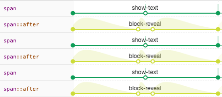
Animations inspector shows that text is revealed at the point our block is paused in the middle 👍
⚠️️ Note:: that in a performance critical set up it could be preferable to use opacity to reveal the text. To do this, we could wrap each span again and use the pseudo element of that wrapper as the block.
Right. Let’s add that stagger. There’s a few ways we can do this. The simplest is going to be applying an animation-delay via the nth-child selector.
.block-reveal span:nth-child(1),
.block-reveal span:nth-child(1):after { animation-delay: 1.1s; }
.block-reveal span:nth-child(2),
.block-reveal span:nth-child(2):after { animation-delay: 1.2s; }
.block-reveal span:nth-child(3),
.block-reveal span:nth-child(3):after { animation-delay: 1.3s; }We could clean this up a little with inline CSS variables.
<div class="block-reveal">
<span style="--delay: 1.1;">Hey</span>
<span style="--delay: 1.2;">there</span>
<span style="--delay: 1.3;">reader!</span>
</div>.block-reveal span {
animation: show-text 0.5s calc(var(--delay, 0) * 1s) steps(1) both;
}
.block-reveal span:after {
animation: block-reveal 0.5s calc(var(--delay, 0) * 1s) both;
}Remove the opacity declaration from our block and we get

Nice 🎉
Great! That’s what we wanted. We could always take it a little further with those inline CSS variables. We could define the speed, different colors etc.

Check out this pen by Jhey (@jh3y) on CodePen.
Can’t we loop this? permalink
Consider we only have one block and we want to cycle through the words “Hey”, “there” and “reader!”.

The block needs to size dynamically 🤔
To do this with only CSS would be tricky. There’s a few hurdles to overcome. We would need to account for animating different blocks across the words. We could try and animate blocks for each word in parallel. We could try to create animations with large pauses and sync them up. Chrome’s Animations inspector would be invaluable for this.
/* Example keyframe with large built-in delay to account for looping */
@keyframes block-reveal-show-text--1 {
0%, 30%, 100% { color: transparent; }
15%, 30% { color: #000; }
}One of the major issues is the fact that our words are likely to differ in length. If the next word is shorter than the current word, the next block won’t cover the current word. We would need to run the reveal twice. Once to reveal the word and once to hide. But as the blocks animate at the same speed and cover different sizes, this might look a little off.
Any solution is also going to be tricky to maintain when our phrases grow. We would also need to account for staggering. The issue with a pure CSS solution is not only the maintainability, but scalability.
A JavaScript solution permalink
With JavaScript we can create a maintainable and scalable solution. As we are going to handle animation from our JavaScript code, we will use GreenSock(GSAP).
Don’t worry if you haven’t used GSAP before. The code is intuitive and I will explain each part.
Markup permalink
Now we are going to loop through phrases, our markup will need to change. Consider an example where we first show “Hey there reader!” followed by “How are you?”. Our markup structure needs to compliment what we are trying to achieve. It needs to be easy for us to access the next word to reveal on a line as we loop.
GSAP also doesn’t have the ability to animate pseudo elements. So we will need to add an extra element to our lines that acts as the sliding block.
Instead of;
<div class="block-reveal">
<span>Hey</span>
<span>there</span>
<span>reader!</span>
</div>Something like the following will be more suitable;
<div class="block-reveal">
<div class="block-reveal__line">
<span class="block-reveal__word">Hey</span>
<span class="block-reveal__word">How</span>
<span class="block-reveal__block" />
</div>
<div class="block-reveal__line">
<span class="block-reveal__word">there</span>
<span class="block-reveal__word">are</span>
<span class="block-reveal__block" />
</div>
<div class="block-reveal__line">
<span class="block-reveal__word">reader</span>
<span class="block-reveal__word">you?</span>
<span class="block-reveal__block" />
</div>
</div>New markup structure will make things easier 💪
This does make it trickier to generate our markup. We could delegate this to our JavaScript later on if we wish. And for a React version, we would need to.
Styling permalink
Our container styling remains the same. We also transfer the pseudo element styling from before to the new block elements.
.block-reveal {
display: inline-flex;
flex-direction: column;
position: relative;
}
.block-reveal__block {
background: #639;
bottom: 0;
left: 0;
opacity: 0.5; /* For dev */
position: absolute;
right: 0;
top: 0;
}We want all the words in a line to sit on top of each other. But, we want to avoid using absolute positioning. This would make positioning the block reveal container in a layout tricky.
.block-reveal__line {
display: grid;
justify-items: flex-start;
position: relative;
}
.block-reveal__word {
font-size: 4rem;
font-weight: bold;
grid-column: 1;
grid-row: 1;
}The trick here is to use display: grid on the line elements and make every word sit in the first column and row of that grid. That way our container doesn’t lose its width due to absolute positioned children 🎉

Looks like a mess, but this is exactly what we want 👍
Now everything is sitting in the right place we can hide the text and blocks.
.block-reveal__block {
transform-origin: left;
transform: scaleX(0);
}
.block-reveal__word {
opacity: 0;
}As the line element will be the width of the largest word, sliding the block across won’t work as it did. The solution is to increase the scaled width of the block from 0 to 1 changing the transform-origin at the mid point. Before doing that, we calculate and set how big the block should be. Its size should match whichever is biggest out of the current word and the next word 👍
JavaScript permalink
Let’s start by creating a new class for our block reveal. This class will accept parameters for a DOM element and an options Object.
class BlockReveal {
element = undefined
options = {}
constructor(element, options) {
this.element = element
this.options = { ...this.options, ...options }
}
}Those options will define timings for our block reveal that are passed into GSAP 📽
As we will need to make some DOM related queries, let’s store our classes in a CLASSES Object for reference.
const CLASSES = {
BLOCK: 'block-reveal__block',
LINE: 'block-reveal__line',
WORD: 'block-reveal__word',
}We now have a choice to make. If our lines don’t have the same number of children, should we pad them out or throw an Error? For this solution, let’s make that check in the constructor and throw an Error if there’s a mismatch 💪
this.wordsPerLine = this.element
.querySelector(`.${CLASSES.LINE}`)
.querySelectorAll(`.${CLASSES.WORD}`).length
const sameLineLength = [
...this.element.querySelectorAll(`.${CLASSES.LINE}`)
].every(
v => v.querySelectorAll(`.${CLASSES.WORD}`).length === this.wordsPerLine
)
if (!sameLength)
throw new Error('BlockReveal: Lines need to be the same amount of words')Now we’ve made our check and know we can proceed. Let’s cache all the elements we will need access to and store them on the class instance.
class BlockReveal {
element = undefined
elementCache = {
blocks: undefined,
words: [],
}
options = {}
wordsPerLine = undefined
constructor(element, options) { ... }
cacheElements = () => {
// Cache the blocks
this.elementCache.blocks = this.element.querySelectorAll(
`.${CLASSES.BLOCK}`
)
for (let i = 0; i < this.wordsPerLine; i++) {
this.elementCache.words.push(
this.element.querySelectorAll(
`.${CLASSES.LINE} .${CLASSES.WORD}:nth-of-type(${i + 1})`
)
)
}
}
}Now we can get started on the magic with GSAP ✨
The idea is that we create a GSAP Timeline that staggers animating the blocks to reveal the words. Repeating the Timeline will reveal the next set of words and so on.
There are two major steps to the Timeline 🎥
- Animate the blocks in.
- Animate the blocks out.
The trick is to hook into the onStart and onComplete when we animate the blocks in. At this point we are able to show/hide the words whilst updating the transform-origin on the blocks 👌
To do this, we need to track the index of the current word we are on. We can then use this index to grab elements from the elementCache.
Let’s start by creating the Timeline.
const TL = new TimelineMax({
delay: 5,
repeat: 2,
repeatDelay: 1,
})delay is the initial delay before our Block Reveal starts. repeat is the number of reveals that happen. Setting repeat: -1 will infinitely loop our Block Reveal 👌 We have two phrases, so repeat: 2 would reveal our first phrase, then the second and stop. Lastly, repeatDelay is the delay between each reveal 👍
The options used for our TimelineMax could be passed in when we instantiate the class 😉 We will update the options on our class to hold defaults that can be extended and referenced.
const {
options: { delay, repeat, repeatDelay }
} = this
const TL = new TimelineMax({
delay,
repeat,
repeatDelay,
})Let’s add the first step to our Timeline.
GSAP provides the perfect API for our needs. staggerTo allows us to animate all of our blocks at the same time with a slight stagger.
This is the trickiest part to all of our Block Reveal so bear with it 💪 🐻
We need to add a staggerTo call to our Timeline that animates the X scale on our blocks.
TL.add(
TweenMax.staggerTo(
this.elementCache.blocks,
0.4,
{ onStart, transformOrigin: 'left', scaleX: 1 },
0.2,
onComplete
)
)This code animates all our block elements in a stagger from transform: scaleX(0) to transform: scaleX(1). Each animation takes 0.4 seconds and the animations are staggered by 0.2 seconds.
onStart permalink
In our onStart we will resize our blocks’ widths to that of the largest between the current word and the next word.
We iterate through the next words and compare their width to the current words. Whichever has the largest width becomes the width of the block for that reveal. We use getBoundingClientRect and Math.ceil to make sure we cover the word. This accounts for where offsetWidth might return 117 for a word that is actually 117.39 pixels wide.
const onStart = () => {
const nextWords = this.elementCache.words[this.index]
newWords.forEach((word, index) => {
const current =
word.previousElementSibling ||
word.parentElement.children[this.wordsPerLine - 1]
const reveal = this.elementCache.blocks[index]
const wordWidth = Math.ceil(word.getBoundingClientRect().width)
const currentWidth = Math.ceil(current.getBoudingClientRect().width)
reveal.style.width = `${
current.style.opacity ? Math.max(wordWidth, currentWidth) : wordWidth
}px`
})
}But wait, wouldn’t it make more sense to cache the reveal widths for each index too? Yes, we could do that so we needn’t make the comparisons on each animation 👍
We can add a new method on the class that we invoke in the constructor after creating the elementCache.
cacheBlockWidths = () => {
// Iterate through the elementCache words
this.elementCache.words.forEach(phrase => {
const blockWidths = []
// For each word in the phrase, calculate the correct block width
phrase.forEach(word => {
const current =
word.previousElementSibling ||
word.parentElement.children[this.wordsPerLine - 1]
const wordWidth = Math.ceil(word.getBoundingClientRect().width)
const currentWidth = Math.ceil(current.getBoundingClientRect().width)
blockWidths.push(Math.max(wordWidth, currentWidth))
})
this.blockWidths.push(blockWidths)
})
/**
* Push one last set of widths which equate to when everything is blank
* and we are revealing the first set of words.
*/
this.blockWidths.push(
[...this.elementCache.words[this.index]].map(word =>
Math.ceil(word.getBoundingClientRect().width)
)
)
}That last part is important. When we start, we see no text. The first set of block widths before looping should equal the width of the first words we see.
⚠️ NOTE:: One thing to bear in mind here is responsive font sizes. We will likely need to restart the animation and re-cache the block widths on page resize.
Now we can update our onStart to set the reveal size by looking up the cached block widths. We can add a counter variable to our class so we know when to use that set of widths equal to the first words.
const onStart = () => {
const nextWords = this.elementCache.words[this.index]
nextWords.forEach((word, index) => {
const block = this.elementCache.blocks[index]
block.style.width = `${
this.blockWidths[this.ran ? this.index : this.wordsPerLine][index]
}px`
})
}I promise that’s the trickiest bit out of the way now 🙌
onComplete permalink
The onComplete grabs all the previous words and sets their opacity to 0 to hide them. It sets opacity: 1 on all the new words to show them. And it sets the transform-origin of all the blocks to right.
const onComplete = () => {
const {
elementCache: { blocks, words },
index,
wordsPerLine,
} = this
const previousWords = words[index === 0 ? wordsPerLine - 1 : index - 1]
const newWords = words[index]
for (const word of previousWords) {
word.style.opacity = '0'
}
for (const block of blocks) {
block.style.transformOrigin = 'right'
}
for (const word of newWords) {
word.style.opacity = '1'
}
}All that’s left is to animate the blocks back out to reveal the next word.
TL.add(
TweenMax.staggerTo(
this.elementCache.blocks,
0.4,
{ scaleX: 0 },
0.2,
onCompleteOut
)
)onCompleteOut is for updating a counter variable and updating the word index. Nothing crazy 👍
const onCompleteOut = () => {
this.index = this.index + 1 > this.wordsPerLine - 1 ? 0 : this.index + 1
this.ran += 1
}Tidying up, we can make any animation durations part of our options. We can also make any styling changes we like such as different block colors etc. To infinitely loop the block reveal, set the repeat to -1 👍
const block = document.querySelector('.block-reveal')
const myBlockReveal = new BlockReveal(block, {
delay: 1,
repeat: -1,
repeatDelay: 1,
blockStagger: 0.15,
blockSlide: 0.5,
})
myBlockReveal.start()
That’s it! permalink
If you’ve got this far, thank you so much for reading. You can now create a looping Block Reveal effect from scratch using GreenSock 💪
Check out this pen by Jhey (@jh3y) on CodePen.
Please do check out the code in the demos and be sure to check out the collection. I’ve also included a React port for those looking to add this to a React app. And also a JavaScript version that generates the markup for you!