Getting Started With Styletron
Styletron is a toolkit for component-oriented styling comprising of CSS in JavaScript flavouring. It’s great for React apps but you can use it elsewhere too!
What’s CSS in JS? permalink
It’s exactly that. Defining your styling within JavaScript. The major benefit being that we can abstract styling to the component level.
const Button = styled('button', {
background: '#276EF1',
color: '#FFFFFF',
cursor: 'pointer'
})You also get the full power of JavaScript within your styling. Global class name pollution or creating bloated style sheets are no longer a concern 🙌
There are some great resources about CSS in JS. Here’s a great speaker deck about CSS in JS. It’s almost 5 years old but the concepts still hold true 👍
There are many CSS in JS libraries available. Each have their own take on how CSS in JS should be. Styletron is one of those libraries. Valerii Sorokobatko has curated some of the popular options.
Styletron permalink
So what makes Styletron any different? It boasts high performance and scalability. It’s component-oriented. But these aren’t what sets it apart.
The unique selling point for Styletron is its novel approach to CSS in JS. Other libraries do things like inline styles or generate scoped classes.
.css-1lvna780 {
color: red;
line-height: 10px;
}Styletron gathers its speed with what it terms as “Virtual CSS Classes”. For every component style declaration created, Styletron creates several atomic single declaration classes. It never duplicates them. After time, new style declarations result in permutations of already generated atomic classes. So there’s zero class bloat. This results in a lot less CSS and a huge performance gain! 🚀
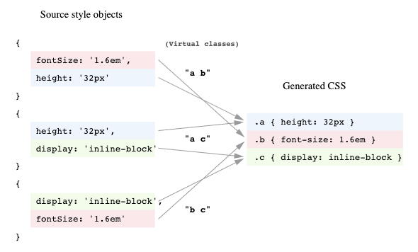
The above graphic is from Ryan Tsao's “Virtual CSS with Styletron”
With Styletron, you gain the benefit of atomic CSS without the overhead. You write your styles, it does the utility class part for you! It’s atomic CSS from JS.
Example permalink
Let’s go through some features with an example. The “Hello World” of components tends to be the button. Let’s create a Button component with Styletron.
The Basic Button permalink
const Button = styled('button', {
background: '#276EF1',
color: '#FFFFFF',
cursor: 'pointer'
})That’s our basic Button.
It is not very special. Let’s make something different for this demo 🤓
How about something like this.
Creating a fancier Button permalink
Let’s start by styling the foundation for our Button. Nothing special happening here.
const Button = styled('button', {
background: 'transparent',
border: '4px solid #276EF1',
borderRadius: '4px',
color: '#276EF1',
cursor: 'pointer',
fontWeight: 'bold',
padding: '8px 16px',
position: 'relative'
})The trick to our solution is to use a clip-path on our Button's :after pseudo element. Styletron allows nested objects so we can define media queries, pseudo selectors etc.
We want to copy the Button styling onto the :after element and use the content property for the text. Hardcoding that content property won't do though.
const Button = styled('button', {
background: 'transparent',
border: '4px solid #276EF1',
borderRadius: '4px',
color: '#276EF1',
cursor: 'pointer',
fontWeight: 'bold',
padding: '8px 16px',
position: 'relative',
':after': {
background: '#276EF1',
bottom: 0,
color: '#FFFFFF',
content: '"Click Me!"',
fontWeight: 'bold',
left: 0,
padding: '8px 16px',
position: 'absolute',
right: 0,
top: 0
}
})Fortunately, the second argument to our styled function can also be a function. The parameter for which is the components’ props! That means we can use props.children for the content prop.
const Button = styled('button', props => ({
':after': {
content: `"${props.children}"`,
}
}))As we are copying styles to the pseudo element, we can extract these into a variable and spread them.
const buttonStyles = {...}
const Button = styled('button', props => ({
...buttonStyles,
':after': {
...buttonStyles,
background: '#276EF1',
border: 0,
bottom: 0,
borderRadius: 0,
color: '#FFFFFF',
content: `"${props.children}"`,
left: 0,
position: 'absolute',
right: 0,
top: 0,
}
}))Let’s create that clip-path for our fancy effect.
const Button = styled('button', props => ({
...buttonStyles,
':after': {
...buttonStyles,
clipPath: 'polygon(-25% -5%, -25% -5%, -5% 105%, -25% 105%)',
transition: 'clip-path .25s ease',
},
':hover:after': {
clipPath: 'polygon(-25% -5%, 105% -5%, 125% 105%, -25% 105%)'
}
}))
When we aren’t hovering the Button, the :after element clips out of sight. On hover, the clip adjusts to reveal the :after element. We add a transition to give an animated effect. Note at this stage that Styletron will handle all the vendor prefixing for us! 🙌
Theming permalink
Most buttons come in a variety of colors, think Bootstrap etc. We can do this with theming. To use themes with Styletron, we create a new styled function using React Context ⚛️
import React, { createContext } from 'react'
import { createStyled } from 'styletron-react'
import { driver, getInitialStyle } from 'styletron-standard'
const { Consumer, Provider } = createContext()
const THEME = {
colors: { PRIMARY: '#276EF1', SECONDARY: '#95A5A6' }
}
const ThemeProvider = ({ children }) => (
<Provider value={THEME}>{children}</Provider>
)
const wrapper = StyledComponent => props => (
<Consumer>
{theme => <StyledComponent {...props} $theme={theme} />}
</Consumer>
)
const styled = createStyled({ wrapper, getInitialStyle, driver })This gives us a ThemeProvider that we wrap round the root of our app. This makes the theme available as a $theme prop for our components.
That $ prefix is important. This is Styletron's way of filtering out props. Any props without the prefix get passed to the underlying React component. This isn't what we always want. React will throw warnings for DOM props it doesn't recognize. Any props that are style related we should prefix with $.
We can extend our styles by creating functions that will grab the correct color for a Button based on props.
const getButtonColor = props => {
const { colors } = props.$theme;
let color = colors.PRIMARY;
if (props.$primary) color = colors.PRIMARY;
if (props.$secondary) color = colors.SECONDARY;
return color;
};Integrating the functions like so.
const Button = styled('button', props => {
const color = getButtonColor(props)
const styles = getButtonStyles(color)
return {
...styles,
':after': {
...styles,
...otherStyles
},
':hover:after': {
...hoverStyles
}
}
})Will give us themed buttons!
Special props permalink
Styletron also exposes two special props you can use on your components. $as will render the underlying component as a different HTML element.
<Button
$as='a'
href='https://styletron.org'
target='_blank'
rel='noreferrer noopener'>
Check out Styletron!
</Button>It’s common to see developers want to render an anchor that looks like a button. We could create a Styletron anchor using our Button component.
The other prop is $ref. This works the same as the ref you will be familiar with. All you need do, is replace instances of ref with $ref where you are using a Styletron component.
Pitfalls and Drawbacks permalink
Although there are some, none of these should deter you from using Styletron. There’s no way to select descendants or use combinators such as >, ~, + etc. This is not a draw back though. Component design should mitigate this.
There’s no value fallback for properties (Yet 🙂*)*.
Don’t mix shorthand and longhand properties. You can use both but don’t combine them. There’s no guarantee what will take precedence.
// DON'T DO THIS
border: '4px solid blue',
borderWidth: '10px'
// DO EITHER THIS
border: '10px solid blue'
// OR THIS
borderColor: 'blue',
borderStyle: 'solid',
borderWidth: '10px'It’s also worth noting that any media queries will reorder in a mobile first fashion.
// THIS
screen and (min-width: 1200px)
screen and (min-width: 768px)
// BECOMES THIS
screen and (min-width: 768px)
screen and (min-width: 1200px)Last. It’s hard to debug components built with Styletron. This is true whenever we use atomic CSS though. There’s a workflow impact due to the fact we can’t see an amalgamation of styles for a component. There are dev tools in the works to help with this though 💪 (These are currently at the PR stage)
Conclusion permalink
Styletron is a great CSS in JS solution that should feel familiar if you’ve tried other CSS in JS offerings. You get the benefit of atomic CSS without the learning curve or politics. The speed gain and file size savings are significant.
You can read more about the performance side of things in Ryan Tsao’s own intro to Styletron.
Be sure to check out the concepts.
And have a play with the demo code